
ggplotのgeom_signifを使って有意差を描きこんだグラフを作る。
データはRに組み込まれているサンプルデータであるirisのデータセットを利用します。
3群でLengthを比較
手順
- irisデータを読み込み
- Shapiro-Wilk testで正規性の検定
- ↑ p < 0.05ならノン・パラメトリック検定
- ggplotでグラフを書く
- geom_signifで有意差を書き込んでいく
- 最後にグラフの全体を調整して仕上げる
とりあえず、scriptの全貌
〜
help(iris)  #description of iris data

dat <- iris # import iris data
attach(dat)

library(dplyr)
library(psych)

# show overall summary
describeBy(iris,Species)
# show only length of each species
describeBy(Sepal.Length ,Species)

#Shapiro test if p<0.05  use non-parametric test
shapiro_Sepal.Length <- shapiro.test(dat$Sepal.Length)
shapiro_Sepal.Length  #show p value

#non parametric test
p_value_Sepal.Length <- pairwise.wilcox.test(dat$Sepal.Length, df_length$Species)
p_value_Sepal.Length  #show p vaue


###################################
#library for plot

library(ggplot2)
library(ggsignif)
library(gridExtra)
library(ggpubr)
library(rstatix)

p_length <- ggplot(dat , mapping = aes(x = Species, y = Sepal.Length))
p_length <- p_length + geom_boxplot(fill = "lightblue")
p_length

p_length <- p_length + geom_signif(comparisons = list(c("setosa", "versicolor")),
                                   map_signif_level=TRUE,
                                   y_position = 7,
                                   annotation="** p<0.001",
                                   fontface="italic",
                                   textsize=10)

p_length <- p_length + geom_signif(comparisons = list(c("virginica", "versicolor")),
                                   map_signif_level=TRUE,
                                   y_position = 8,
                                   annotation="** p<0.001",
                                   fontface="italic",
                                   textsize=10)

p_length <- p_length + geom_signif(comparisons = list(c("setosa", "virginica")),
                                   map_signif_level=TRUE,
                                   y_position = 8.8,
                                   annotation="** p<0.001",
                                   fontface="italic",
                                   textsize=10)
# adjusting of y lim
p_length <- p_length + ylim(2,10)
# change to white back groud
p_length <- p_length + theme_classic()
# adjusting of aspect ratio
p_length <- p_length + theme(aspect.ratio=1)
# adjusting of aspect ratio
p_length <- p_length + theme(text = element_text(size = 30))

p_length
〜
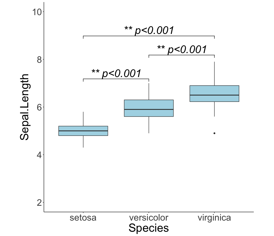
できあがりはこんな感じ
↓↓↓に各パールを解説
このように書くとirisのデータの内容を確認できる。
〜
dat <- iris # import iris data
attach(dat)
iris
〜
サクッと全体像を確認。
〜
# show overall summary
describeBy(iris,Species)
# show only length of each species
describeBy(Sepal.Length ,Species)
〜

正規性を検定。p値を確認。今回はwilcoxonの検定を使う。
〜
#Shapiro test if p<0.05  use non-parametric test
shapiro_Sepal.Length <- shapiro.test(dat$Sepal.Length)
shapiro_Sepal.Length  #show p value

#non parametric test
p_value_Sepal.Length <- pairwise.wilcox.test(dat$Sepal.Length, df_length$Species)
p_value_Sepal.Length  #show p vaue

〜
Shapiro testの結果

wilcoxonの結果

とりあえず、グラフをみてみる。
〜
p_length <- ggplot(dat , mapping = aes(x = Species, y = Sepal.Length))
p_length <- p_length + geom_boxplot(fill = "lightblue")
p_length
〜

geom_signifを使って有意差の結果を入れていく。
そして、その後に微調整
〜
p_length <- p_length + geom_signif(comparisons = list(c("setosa", "versicolor")),
                                   map_signif_level=TRUE,
                                   y_position = 7,
                                   annotation="** p<0.001",
                                   fontface="italic",
                                   textsize=10)

p_length <- p_length + geom_signif(comparisons = list(c("virginica", "versicolor")),
                                   map_signif_level=TRUE,
                                   y_position = 8,
                                   annotation="** p<0.001",
                                   fontface="italic",
                                   textsize=10)

p_length <- p_length + geom_signif(comparisons = list(c("setosa", "virginica")),
                                   map_signif_level=TRUE,
                                   y_position = 8.8,
                                   annotation="** p<0.001",
                                   fontface="italic",
                                   textsize=10)
# adjusting of y lim
p_length <- p_length + ylim(2,10)
# change to white back groud
p_length <- p_length + theme_classic()
# adjusting of aspect ratio
p_length <- p_length + theme(aspect.ratio=1)
# adjusting of aspect ratio
p_length <- p_length + theme(text = element_text(size = 30))

p_length
〜
↑のできあがりのグラフになる。
今回は群間の比較をバラバラで行った。
scriptの書き方で一連で終える方法もあるようです。(群の組み合わせとp値をlist化する)
3群くらいであれば確認しながらできるので、この方法でもOKかと思います。